
Previous entry:
Cut Glue Paint
Next Entry:
What Architecture Has in Common with Science
Home:
One Truth For All
| Sun | Mon | Tue | Wed | Thu | Fri | Sat |
|---|---|---|---|---|---|---|
| 1 | 2 | 3 | 4 | 5 | ||
| 6 | 7 | 8 | 9 | 10 | 11 | 12 |
| 13 | 14 | 15 | 16 | 17 | 18 | 19 |
| 20 | 21 | 22 | 23 | 24 | 25 | 26 |
| 27 | 28 | 29 | 30 | 31 |
Archives
- May 2008
- April 2008
- March 2008
- February 2008
- December 2007
- November 2007
- October 2007
- September 2007
- August 2007
- July 2007
- May 2007
- April 2007
- March 2007
- February 2007
- December 2006
- November 2006
- October 2006
- September 2006
- August 2006
- July 2006
- June 2006
- May 2006
- April 2006
- March 2006
- February 2006
- January 2006
- December 2005
- November 2005
- October 2005
- September 2005
- August 2005
- July 2005
- June 2005
- May 2005
- April 2005
- March 2005
- February 2005
- January 2005
- December 2004
- November 2004
- October 2004
- September 2004
- August 2004
- July 2004
- June 2004
- May 2004
- April 2004
- March 2004
- February 2004
- January 2004
- December 1969
December 4, 2004
Many Models
Yesterday was the last day of classes, and at the College of Architecture and Environmental Design that means one thing: crits!
I have some photos from third and fourth year crits, plus photos from my own studio: my classmates and my work. So read on.
Out n the Dexter Lawn, there was a setup from a third year studio. They had to use a four foot cube, all white, and make something that seemed more undefined than I'm sure it really was, from talking to the students. Bear in mind that just about everybody is operating on five hours of sleep this week, so nobody was really coherent.
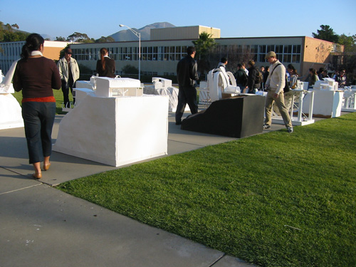
I took a bunch of photos of models for reference, and this is one of them. I liked how the roof curved and was angular at the same time.
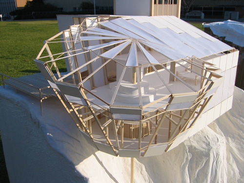
Then I went down to the fourth year crit in the gallery, and oh, wow. I've got to figure out how to build models like these. The project was a rebuilding of a block in an Italian neighborhood, to make a community center.
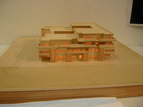
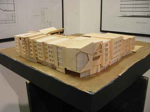
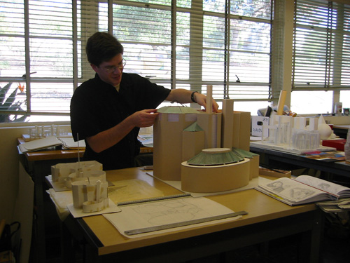
OK, so here are some photos from my own studio. Our project was called "A Gallery of Desert Spaces" and had to fit into a 75' cube at 1/4" scale (that's an 18 3/4" cube, for your reference) and touch all planes of the cube. Some of the work was really stunning, so I've taken pictures of my favourites.
This guy Katsunori is clearly too advanced to be in this studio. What you can't see in this picture is that the model comes apart like a puzzle. It was stunning.
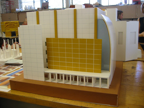
Eric has been building models for a while. He did a really good job on his textures and finishes, especially the copper roofs.
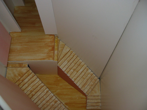
I have some other pictures of this model, but this is my favourite. Look at those stairs! So perfect.
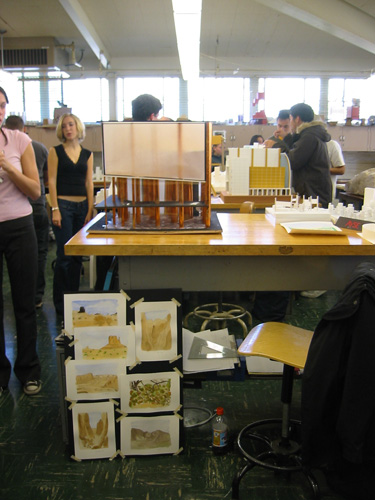
Now on to my own model. We had to make a desk setup that included the watercolours we did as research and preparation for this model. I taped mine roughly on a board to make them look like notes pinned up at a desk. Some people liked that and some people thought it looked unfinished.
This is the model alone. The bottom is a lobby area, the frosted glass hides the gallery itself.
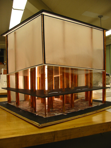
A closer photo of the lobby. The floor is made of a mosaic of pictures of the desert, blown up and turned into textures. That went over REALLY well. A lot better than I expected. People thought it was the most successful part of the model. Until they saw the next view.
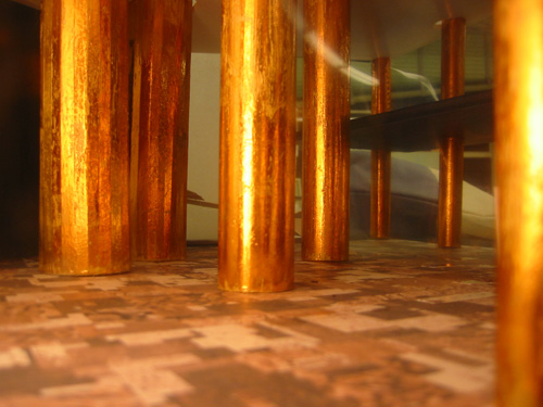
The centerpiece of my design was a room called "The Vastness of the Valley." It's a 75'x75' room with a tilted floor and ceiling, to make it look larger, and just the columns running through it. I lined up the columns and made them decrease in size to enhance the effect. My teacher loved it, and people who peeked in thought it worked really well.
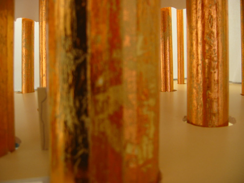
After the crit, I walked home (because the bus schedule is mysteriously different on Fridays) and forced myself to stay awake until a reasonable hour. Very tiring, but I feel good about being done. Now I only have physics, engineering, and environmental design finals.
Posted by ayse on 12/04/04 at 8:49 AM