
Previous entry:
Silly Dances
Next Entry:
Going Native
Home:
One Truth For All
| Sun | Mon | Tue | Wed | Thu | Fri | Sat |
|---|---|---|---|---|---|---|
| 1 | 2 | 3 | 4 | 5 | ||
| 6 | 7 | 8 | 9 | 10 | 11 | 12 |
| 13 | 14 | 15 | 16 | 17 | 18 | 19 |
| 20 | 21 | 22 | 23 | 24 | 25 | 26 |
| 27 | 28 | 29 | 30 | 31 |
Archives
- May 2008
- April 2008
- March 2008
- February 2008
- December 2007
- November 2007
- October 2007
- September 2007
- August 2007
- July 2007
- May 2007
- April 2007
- March 2007
- February 2007
- December 2006
- November 2006
- October 2006
- September 2006
- August 2006
- July 2006
- June 2006
- May 2006
- April 2006
- March 2006
- February 2006
- January 2006
- December 2005
- November 2005
- October 2005
- September 2005
- August 2005
- July 2005
- June 2005
- May 2005
- April 2005
- March 2005
- February 2005
- January 2005
- December 2004
- November 2004
- October 2004
- September 2004
- August 2004
- July 2004
- June 2004
- May 2004
- April 2004
- March 2004
- February 2004
- January 2004
- December 1969
April 25, 2005
Biology is Destiny
I guess I should have known something like this would happen when I started designing a building based on hands and bones and tendons. Somehow, my design for our latest project has morphed into a bony structure with chunky, knuckle-like bits, lacing over a twisty, organic staircase in the shape of a uterus and ovaries.
Maybe there is something to the theory that all good artists are insane.
Here's my first pass at a study model. We were assigned a location between two wings of a building on campus, with the requirement that the space accommodate all existing circulation (people passing from one place to another through the space), a pin-up area for second-year architecture students, and at least one "ritual" that is unique to the experience of being an architecture student.
My ritual was the mass migration to studios at one o'clock -- all architectural studios are 1 to 6, Monday, Wednesday, and Friday. So at that time we all get up and walk up to our studios and get to work (well, approximately).
Our first assignment was to make a light study (warning: large) of the model, using a little sun dial thing and a digital video camera.
I left the building very open on the North exposure, which opens onto the Dexter Lawn where in fine weather you often see students sacked out in the sun between classes.
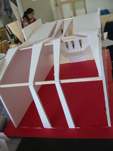
The South exposure is closed up, with just a few narrow slits cut into the wall to allow the sun to slant through.
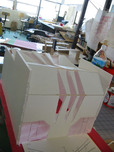
As I worked on the model I refined some of my ideas, adding a lot more thickness to the South wall, and emphasizing the joints in the wall structure by placing floors at that level.
Today I finished the exterior, at least for this revision, and took some photos of the inside in the appropriate light, to see how the changes I made livened the space up.
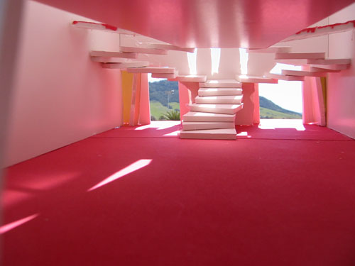
My pinup space is upstairs, with walls tilted to the North that catch light but not glare or direct light. Those walls also funnel light down to the first floor.
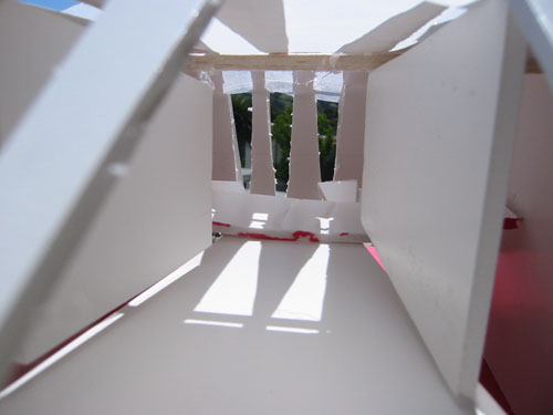
You can see in this photo that I've made some changes to the model, but mostly that's because now it has stuff inside, which the earlier pictures don't show.
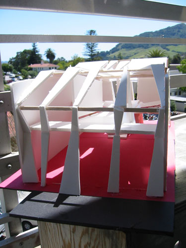
The most dramatic change is the deepening and complicating of the South facade, which is now about 6 feet deep and has slits carved into it to create strips of light across the floor.
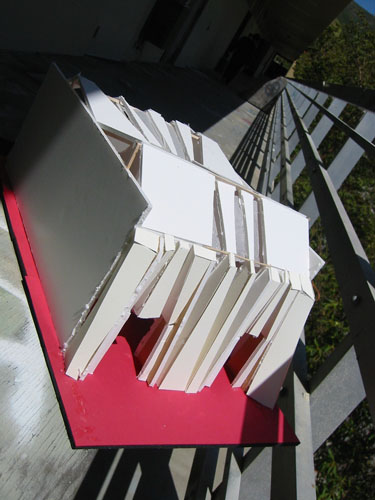
It's funny that the red floor is red because I needed to make a larger base out of smaller materials, and red construction paper was what I had. But activated by light like this it is amazing. The strips of light slant down the staircase between noon and one o'clock, during the school year, to enhance the ritual climb to studio. The stairs curve back on themselves to slow the students down and help the transition from everyday headspace to studio headspace.
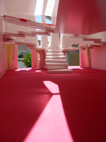
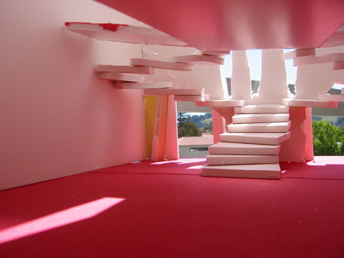
To better understand my model, I made what is called an orange peel drawing, where I unfolded the buckled top and laid it out in front of me. Doing this helped me refine some of the connections and change some of the arrangements of light slits in the ceiling.
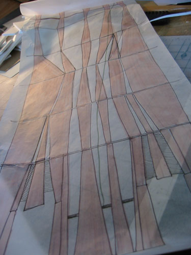
I added a couple more slits because the back seemed to have a pair of large blank panels, and I wanted it to feel skeletal while being massive, rather than feeling like a building.
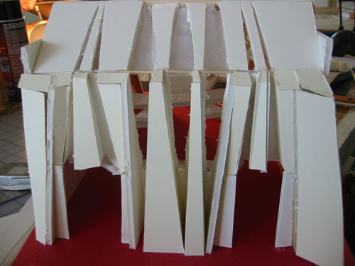
Tomorrow I will being planning some of the other drawings I am going to do -- this project is primarily being presented on paper, which is good (no need to spend hours on model making) and bad (have to measure and systematize every blessed inch of a model I made in a non-systematic process).
Posted by ayse on 04/25/05 at 8:47 PM