
Previous entry:
Pages of Sketches
Next Entry:
Sunset Walk on the Beach
Home:
One Truth For All
| Sun | Mon | Tue | Wed | Thu | Fri | Sat |
|---|---|---|---|---|---|---|
| 1 | 2 | 3 | 4 | 5 | ||
| 6 | 7 | 8 | 9 | 10 | 11 | 12 |
| 13 | 14 | 15 | 16 | 17 | 18 | 19 |
| 20 | 21 | 22 | 23 | 24 | 25 | 26 |
| 27 | 28 | 29 | 30 | 31 |
Archives
- May 2008
- April 2008
- March 2008
- February 2008
- December 2007
- November 2007
- October 2007
- September 2007
- August 2007
- July 2007
- May 2007
- April 2007
- March 2007
- February 2007
- December 2006
- November 2006
- October 2006
- September 2006
- August 2006
- July 2006
- June 2006
- May 2006
- April 2006
- March 2006
- February 2006
- January 2006
- December 2005
- November 2005
- October 2005
- September 2005
- August 2005
- July 2005
- June 2005
- May 2005
- April 2005
- March 2005
- February 2005
- January 2005
- December 2004
- November 2004
- October 2004
- September 2004
- August 2004
- July 2004
- June 2004
- May 2004
- April 2004
- March 2004
- February 2004
- January 2004
- December 1969
November 13, 2005
A Trip and a Model
This weekend the Cal Poly AIAS took a field trip to San Francisco. I joined them for part of it, because I didn't see any point to going to hang out at Fisherman's Wharf but there were two firm tours and a visit to the De Young on the agenda that I was interested in.
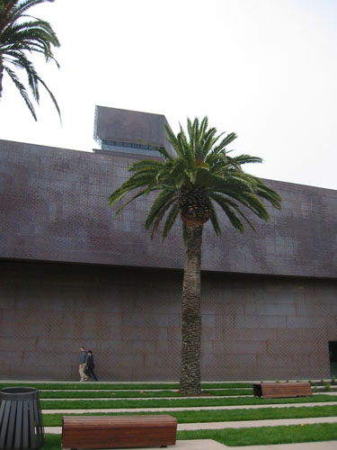
The rebuild De Young museum is nice, but clearly needed more thought given to circulation and usability. You enter a courtyard, and when you get to the door you realize there is a ribboned-off passage to your right, so you have to leave and come back in. Then you get in the door and there are ticket counters to your right, where you stand in line again (no ribbons this time), then there are stands at the entrances to the exhibits that say, "Ticket Check Point," and a lot of people seemed not to understand that they didn't need a special ticket to enter there.
The collection is OK. Not all great but some nice pieces. The museum itself was more interesting, but only in the sense that I found it a good study in how not to make space easy to understand.
Entering the museum, you walk over this installation by Andy Goldsworthy. I love his work, and it was great to see one in person (most of them are ephemeral; the only proof they ever happened is the photo he takes of the piece).
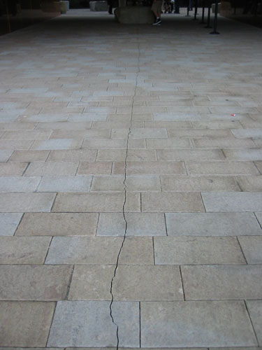
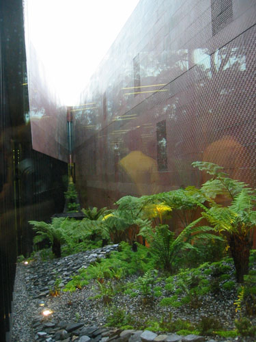
The shape of the museum is broken by this slit that appears and disappears -- very appropriate for a museum that replaces one that was destroyed in an earthquake (as is the Goldsworthy installation with that crack).
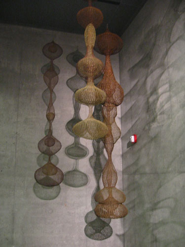
One exhibit I found really compelling was this room full of wire sculptures and their shadows. It seemed more in keeping with the form of the museum than room after room of white gallery walls and hung paintings.
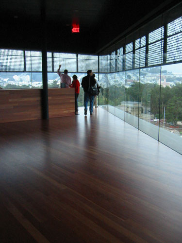
The museum has a nine-story tower, and the observation deck is really stunning. It was fairly foggy, but there was a nice view from the tower even so (you could see the tops of the towers on the Golden Gate Bridge).
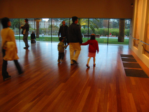
Downstairs, the best white-walls-with-art gallery was this one, where people walking by seemed to be a piece of art on display, and if not for the glass, it would seem like you could just walk out of the museum.
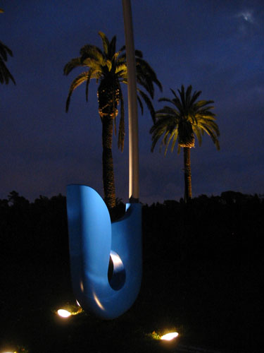
Outside, there is a sculpture garden with this piece in it; most of the other pieces were not lit so I couldn't take pictures (those early sunsets of winter are upon us).
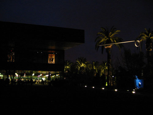
The lighting was not terribly spectacular at night, and the museum seemed to just sort of disappear into the darkness. When that copper siding is all verdigris I'm sure it will be something to behold, though.
After all that fun, I had to go home and build a study model for engineering, to show the structure of my design project (it didn't have to be my design project; I just chose to make it that).
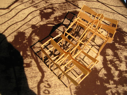
My project is all about circulation, and it would be hard for anybody to show up and not know what to do, what with all the cattle chutes I'm making them walk through. It certainly was interesting to see what can actually get built before anybody asks, "Where is the front door, anyway?"
Posted by ayse on 11/13/05 at 11:31 PM
Leave a comment