Previous entry:
More Beach Time
Next Entry:
A Very Sweet Surprise
Home:
One Truth For All
| Sun | Mon | Tue | Wed | Thu | Fri | Sat |
|---|---|---|---|---|---|---|
| 1 | 2 | 3 | 4 | 5 | ||
| 6 | 7 | 8 | 9 | 10 | 11 | 12 |
| 13 | 14 | 15 | 16 | 17 | 18 | 19 |
| 20 | 21 | 22 | 23 | 24 | 25 | 26 |
| 27 | 28 | 29 | 30 | 31 |
Archives
- May 2008
- April 2008
- March 2008
- February 2008
- December 2007
- November 2007
- October 2007
- September 2007
- August 2007
- July 2007
- May 2007
- April 2007
- March 2007
- February 2007
- December 2006
- November 2006
- October 2006
- September 2006
- August 2006
- July 2006
- June 2006
- May 2006
- April 2006
- March 2006
- February 2006
- January 2006
- December 2005
- November 2005
- October 2005
- September 2005
- August 2005
- July 2005
- June 2005
- May 2005
- April 2005
- March 2005
- February 2005
- January 2005
- December 2004
- November 2004
- October 2004
- September 2004
- August 2004
- July 2004
- June 2004
- May 2004
- April 2004
- March 2004
- February 2004
- January 2004
- December 1969
February 9, 2006
More Drawings
Noel fixed my scanning problem (Image Capture only wants to work in one specific directory, forcing me to leave all my applications in a big jumbly pile instead of nicely sorted out by usage). So I've been scanning my weekly drawings. I've had a bit of a week this week so I didn't do two drawings (I'll do four for next week), but to make up for that I had a backlog of unscanned drawings.
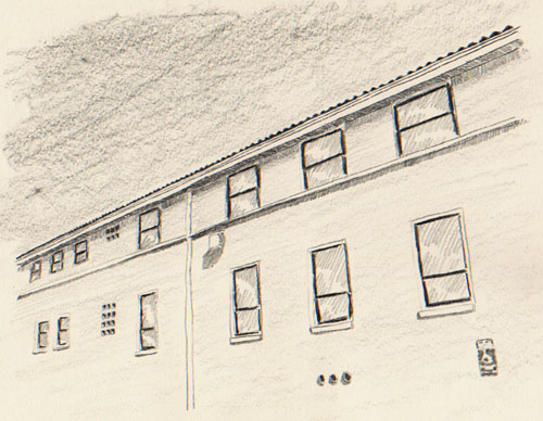
A couple of weeks ago we did our last pencil drawings. I did two drawings of buildings on campus. This one is an office building beyond the stadium. It's an older building, in the fake-Mission style that is so popular in this area.

Technorati Tags: conte crayon, drawings, pencil, school
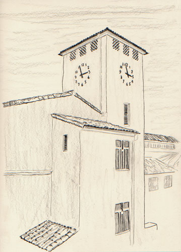
Here's the clock tower -- a somewhat pathetic little tower compared to the ones I'm used to back East, or even the campanile at Berkeley -- again in the fake Mission style. I used to like that style, but seeing it pasted all over everything regardless of scale or appropriateness has really cured me of that.

Then we switched to conte crayon. I hate conte crayon. It's terribly messy, it doesn't want to let me draw the way I like to draw (very tight, not very loose), and it smudges all over the place. Then, as it happened, we had this incredible foggy day, and on days like that the light is just like conte crayon drawings.
My conte crayon method is kind of more meticulous than you are supposed to be. I sketch the outlines lightly in pencil then trace and fill in with the conte crayon. That's because I always work out my sketches in pencil first. It helps me get the proportions right and not worry about making a huge evil mess with the crayon that cannot be erased.
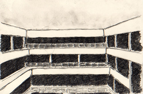
Here's the central courtyard of the library, from the fifth (top) floor. If you knew this scene, you would know that there is a big mountain in the background usually. In the fog, it was completely invisible.

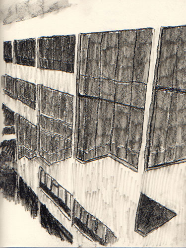
This is the grand staircase in the library. This view is basically 45 degrees to the right of the last drawing, but I think the view changes really dramatically when you look that way because of the staircase. It was really foggy at the bottom, but I did a very poor job of capturing that.

Four more conte crayon drawings, and then we're supposed to go to charcoal (which I also dislike, but not as much as I dislike conte crayon).
Posted by ayse on 02/09/06 at 11:15 PM
What's the difference between fake and real Mission? You mentioned scale and appropriateness. For authenticity should scale=small and appropriate=not on strip mall? Does Mission-style architecture share a family history with Mission furniture?
Fake Mission is basically anything made to look like an old Spanish mission that is not, in fact, a Spanish mission or related building, like the adobes. The walls are thinner than masonry walls, the windows are too big, the roofs too thin. The buildings are random and air conditioned, so unlike a real mission they are not sited to cool themselves or warm themselves with the sun and wind; they just sit on a site and mechanically handle their air. The proportions are different.
It's not that I don't like the style: it can be quite nicely done. It's just that it's not really the same as the missions (and it's not as if there's no easy comparison because there'sa mission right downtown). And I'm kind of tired of it, the way I get tired of every new building emulating the Victorians in San Francisco. I like it when architecture expresses its own time and age, rather than another time and age.
Modern "Mission" furniture is different from the fake-mission housing style. It's a modern, romantic reinterpretations of the rough, handmade, utilitarian furniture made for the missions. That came out of the Arts and Crafts movement in the early 1900s, as a response to the industrialization of traditional crafts.
Good answer. Informative. What architecture (examples) would you say expresses our own time and age? I'm put off constantly by the concrete and stucco (EFBS they call it) that is daily replacing many of our beautiful buildings in downtowns across America.
I think that good, modern architecture tends to be site-responsive. So in one place it will look very different from another. I think the work of Tadao Ando suits the modern Japanese landscape remarkably well, and not so well the city. Norman Foster makes high-rises that respond to the environment, which is just stunning -- I think his work really does reflect a new movement in architecture to bring the environment in rather than fighting it. Renzo Piano's work is awesome, as well, on the same front.
Those guys all make monuments and skyscrapers. I think we're more accepting of different and unusual and avante-garde in monuments and skyscrapers.
On the other hand, housing is conservative and destructive. People want their house to feel brand new (so they rip out everything that was there before and rebuild rather than repair or renovate) but they want it to look as if it had been there forever (so they ape old styles, but with modern proportions because who really wants to live in a real Colonial with six foot ceilings?). Developers are trying to build something for high profits, so they spray on stucco coatings because they go on faster and cheaper than wood or fiber cement siding.
I try to look at those developments without too much prejudice: the house I live in, now considered a Victorian gem, was once just like those ticky-tacky little development houses: cheap and overblown and not at all in the classical style of housebuilding. Not all Victorians survived intact to the modern age, and not all those houses will survive intact to the future. I try to figure out which ones will survive, which models of design are likely to be revered and restored in fifty years.
I think the houses that have the staying power are modern interpretations of the Arts and Crafts, with heavy moldings, porches, the look of "home" that seems to come from a painting. I think people respond to that on a primal level the way they don't necessarily respond to modernist boxes. Then again, I'm sure I'm entirely wrong. Eichler tract houses are now cult items. Strange things happen with time.