Previous entry:
Peace and Harmonium
Next Entry:
Almanac
Home:
One Truth For All
| Sun | Mon | Tue | Wed | Thu | Fri | Sat |
|---|---|---|---|---|---|---|
| 1 | 2 | 3 | 4 | 5 | ||
| 6 | 7 | 8 | 9 | 10 | 11 | 12 |
| 13 | 14 | 15 | 16 | 17 | 18 | 19 |
| 20 | 21 | 22 | 23 | 24 | 25 | 26 |
| 27 | 28 | 29 | 30 | 31 |
Archives
- May 2008
- April 2008
- March 2008
- February 2008
- December 2007
- November 2007
- October 2007
- September 2007
- August 2007
- July 2007
- May 2007
- April 2007
- March 2007
- February 2007
- December 2006
- November 2006
- October 2006
- September 2006
- August 2006
- July 2006
- June 2006
- May 2006
- April 2006
- March 2006
- February 2006
- January 2006
- December 2005
- November 2005
- October 2005
- September 2005
- August 2005
- July 2005
- June 2005
- May 2005
- April 2005
- March 2005
- February 2005
- January 2005
- December 2004
- November 2004
- October 2004
- September 2004
- August 2004
- July 2004
- June 2004
- May 2004
- April 2004
- March 2004
- February 2004
- January 2004
- December 1969
October 23, 2006
Design Crunch
We're on our last week of the design portion of the San Francisco internship program. For five weeks we do an intensive design studio, then for six weeks we work at a firm while doing lectures at night.
Our project for design is an affordable housing project in the Tenderloin, and we could choose between family housing and senior housing, or a mix of the two. I chose senior housing. This week I am working on elevations, having just finished the floor plans for my residential levels (the lower level is commercial space). Wanna see?
Technorati Tags: design, drawings, school
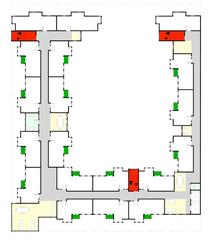
Here's a typical floor plan: the second through fourth floors have this plan. The red areas are egress stairs, the light yellow are common spaces, and the light blue is the laundry room. Sorry it's so blurry: the original is on Arch D paper, 24x36 inches, and it does not like to reduce to something this small.
Anyway, the plan is fairly simple, but things to note are that while there are plenty of units in there (19 per floor), there are lots of open spaces to sit and socialize. That is because the units are teeny-weeny (even though they are entirely accessible).

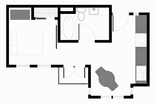
For example, this is the typical unit, 350 square feet. I've designed it as a "split studio," with the bathroom breaking the space into a kitchen/living area, and a bedroom with a sliding panel. That's because a lot of seniors babysit their grandchildren, and need a place for them to take naps. Or couples might want to have some time apart. I think it makes a very small space more livable.

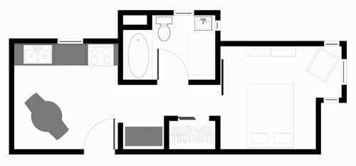
On the ends, I can let light in from two sides, so I do. This unit ends up at 380 square feet, largely because of the bay window in the bedroom. Same split-studio design, too.

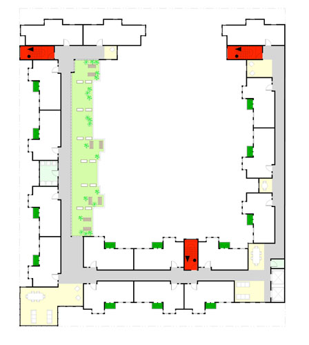
On the top floor I deleted three units and put in a roof garden with benches and planters, so people can grow vegetables or just sit in the sunshine on the few nice days a year. One of the complaints seniors have about their housing is not having good places to exercise, protected from crime. This roof is one of three exercise spaces I have created (the other two are on the ground level: a courtyard walking path, and a long exercise gallery for inclement weather).

I think the second floor will also have roof gardens above the commercial spaces on the first floor, but I haven't finished drafting those yet so I'm not sure how they're going to look. Right now I have to work on doing some more elevations for a conference with my teacher tomorrow afternoon.
I'm going to be buried in this for the next four days. But I'm enjoying it immensely.
Posted by ayse on 10/23/06 at 12:24 AM
Leave a comment