Previous entry:
Smoking Section
Next Entry:
Overrated
Home:
One Truth For All
| Sun | Mon | Tue | Wed | Thu | Fri | Sat |
|---|---|---|---|---|---|---|
| 1 | 2 | 3 | 4 | 5 | ||
| 6 | 7 | 8 | 9 | 10 | 11 | 12 |
| 13 | 14 | 15 | 16 | 17 | 18 | 19 |
| 20 | 21 | 22 | 23 | 24 | 25 | 26 |
| 27 | 28 | 29 | 30 | 31 |
Archives
- July 2008
- May 2008
- April 2008
- March 2008
- February 2008
- December 2007
- November 2007
- October 2007
- September 2007
- August 2007
- July 2007
- May 2007
- April 2007
- March 2007
- February 2007
- December 2006
- November 2006
- October 2006
- September 2006
- August 2006
- July 2006
- June 2006
- May 2006
- April 2006
- March 2006
- February 2006
- January 2006
- December 2005
- November 2005
- October 2005
- September 2005
- August 2005
- July 2005
- June 2005
- May 2005
- April 2005
- March 2005
- February 2005
- January 2005
- December 2004
- November 2004
- October 2004
- September 2004
- August 2004
- July 2004
- June 2004
- May 2004
- April 2004
- March 2004
- February 2004
- January 2004
- December 1969
May 10, 2008
A Little Architecture About Town
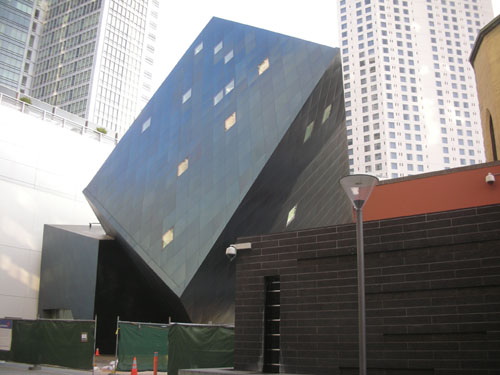
I've changed how I walk to work slightly to avoid all the smokers on Market, and now I go by this site every day. This is the Contemporary Jewish Museum, designed by Daniel Liebskind. Wikipedia says it opened in 2007, but it seems remarkably difficult to get into it on account of how they are in the process of placing concrete to make the large plaza that will connect it to Yerba Buena Gardens. I'm not a big fan of cultural museums like this (I prefer science or art museums), so it hasn't occurred to me to visit before now.

The museum is on a pedestrian alley that connects Market St. to Mission, the location of Beard Papa (which is closed when I make my commute, so no temptation to stop and get a $2.25 cream puff every day, thank goodness) and some interesting water features. There are a few of these pedestrian alleys along Market and they are always interesting, although not always very alive. This one is more so because it has a few restaurants along it, and also it is wider than the usual ones.
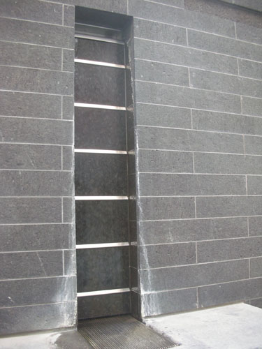
This is one of the fountains, which are very subtle but look like a lot of work (see the mineral stains on the bottom there?). I like how they add the sound of moving water without having spouts of water shooting everywhere. In a windy area, spouts of shooting water always mean wet pedestrians.

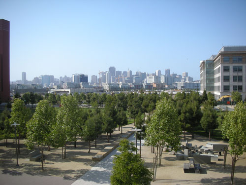
On Wednesday, I got a different view, because a few of us went out to the UCSF Mission Bay campus to do a materials study (holding material samples up to the walls of existing buildings and photographing them for comparison). The building I'm working on is out there, and the client wants the colour scheme to fit with the neighboring buildings to reinforce the sense of campus. While we were there I took this photo, from the terrace on Genentech Hall looking downtown.

The campus is remarkably postmodern, which is not a great thing in my mind -- I think the whole pomo thing is going to look very dated in a very short time. Also, I think it tends to look a little sterile and contrived. Fortunately, most of the buildings have managed to avoid looking like they belong at Disneyland (Michael Graves designed much of Disney's corporate architecture).
UCSF Mission Bay is the research/technology campus (hence places like Genentech Hall) on the edge of a big redevelopment of Mission Bay into a biotech center. It's pretty ambitious on the part of the city, and it seems to be doing well so far.
Technorati Tags: architecture, san francisco
Posted by ayse on 05/10/08 at 10:10 AM
Leave a comment