The AIAS (American Institute of Architecture Students) club from Cal Poly went on a field trip on Saturday to Hearst Castle. It's a nice trip: if you like guided tours and a few tidbits of historical trivia, it's a nice way to spend an afternoon. A little pricey, of course, but just don't make the mistake of planning to eat at the visitor's center and you'll do OK.
I took a lot of pictures, but most of those were note-taking pictures rather than artistically arranged photographs. So I give you a brief selection from our tour (we took Tour 2, which is Hearst's private apartments, the two libraries, and the kitchen; I didn't choose the tour, but that was the tour I happened to be most interested in).
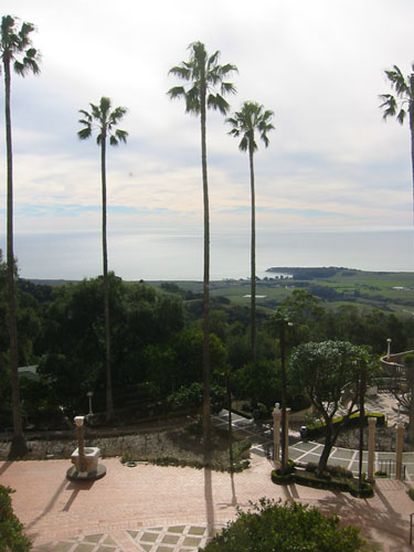
Here's the view from the second floor over the court where guests arrived. A nice view out over the hills to the ocean.
Technorati Tags: antique kitchens, hearst castle, julia morgan, california
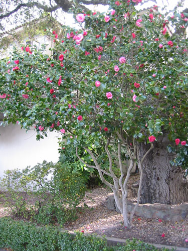
I was very impressed not only with the age of the plantings (which are, of course, from the time when the house was under construction and occupied), but by the way they have been carefully tended over the years. You really cannot get a structure like in this camellia overnight; it takes years and years of good pruning and care.
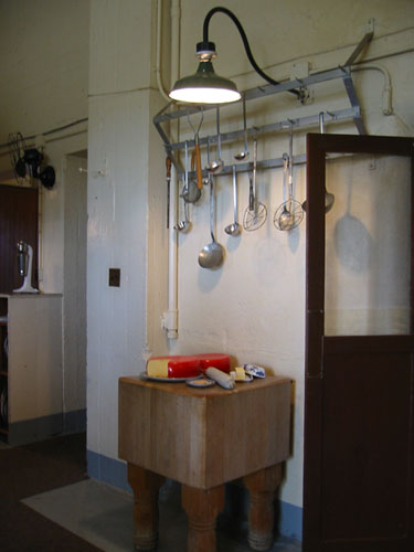
I was very interested in the kitchen, because of course Julia Morgan (the architect who designed the castle) is known for her horrible, non-functional kitchens. There are definitely problems with the design, including the undersized grease trap and a space layout that seems to give no thought to how kitchens function.
But I liked this tool rack, and the use of wall lighting for tasks gave me a good idea for lighting our own kitchen; these wall lights were over every surface where work would be performed, and some provided a more general light.
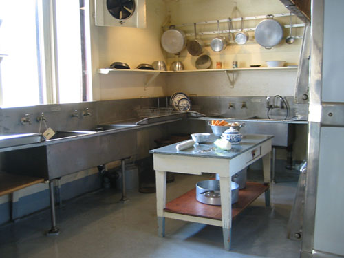
In the area of the kitchen with the sinks (you can see the undersized grease trap under the sink there), there was another tool rack, open shelving, and a very utilitarian stainless steel backsplash. It's interesting how this would be very stylish and modern in a kitchen these days.
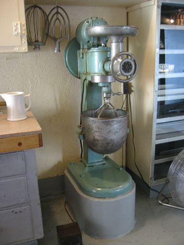
A startlingly large mixer, considering the bowl capacity (that's a half-gallon pitcher there on the counter next to it).
I think it would be interesting to go back during the months when they do Tour 4 (gardens and Casa del Mar); Hearst Castle is definitely not my personal style, but seeing how Morgan approached historical pastiche is interesting. Also, the proportions of the rooms and the mix of spaces are very interesting.
